Introduction
In Oracle APEX, enhancing tab headers with icons can improve the visual appeal of your application and help users identify tab content more quickly. Icons add clarity, especially when tabs represent distinct functions or data sets. By incorporating simple HTML or template settings, developers can easily display icons next to or above tab labels, creating a more engaging and intuitive user experience.
How to Display Icons in Tab Headers in Oracle APEX
To add icons to tab headers in Oracle APEX, follow these steps:
-
Use Region Display Selector Tabs
-
Ensure you’re using a page layout that supports tabs through the Region Display Selector.
-
Create multiple regions and set their Display Selector attribute to Yes.
-
-
Enable HTML in Region Titles
-
Go to each region’s Title attribute.
-
Insert HTML code that includes the icon. For example:
<span class="fa fa-home"></span> Home -
You can use any supported icon library like Font Awesome, Material Icons, or APEX-native icons.
-
-
Using APEX Native Icons
-
Oracle APEX comes with its own icon classes. Example:
<span class="t-Icon fa fa-chart-bar"></span> Reports -
Use the
t-Iconclass to match APEX themes and styling.
-
-
Adjust with Template Options (Optional)
-
Under the region’s Template Options, explore if your theme supports icon positioning or alignment.
-
Some Universal Theme templates allow you to assign icon classes without embedding HTML directly.
-
-
Style with CSS (If Needed)
-
For custom spacing or alignment, add CSS rules using Inline CSS in the page or via the Inline CSS section in Shared Components > Themes > Custom CSS.
.t-RegionDisplaySelector .fa {
  margin-right: 5px;
}
-
-
Test Your Tabs
-
Run the application to ensure that icons appear properly next to the tab headers.
-
Make adjustments to alignment or size if needed.
-
Displaying Icons as Part of Tab Headers in Oracle APEX
Using icons in tab headers enhances the visual appeal and usability of an Oracle APEX application. By incorporating icons, users can quickly identify sections based on visual cues rather than just text. This tutorial explains how to add icons to tab headers using different methods, including static HTML, CSS, and JavaScript.
Step 1: Creating the Tab Structure
Open your APEX application and navigate to the page where you want to add tabs.
In Page Designer, create a Static Content Region to act as the tab container.
Inside this region, create a List, Buttons, or Links to act as tab headers.
Assign Static IDs to these tabs, such as tab_1, tab_2, etc.
Example static HTML for tab headers:
<ul class="custom-tabs">
<li><a href="javascript:void(0);" onclick="showTab(1)"><i class="fa fa-home"></i> Home</a></li>
<li><a href="javascript:void(0);" onclick="showTab(2)"><i class="fa fa-user"></i> Profile</a></li>
<li><a href="javascript:void(0);" onclick="showTab(3)"><i class="fa fa-cog"></i> Settings</a></li>
</ul>
Each <i> tag represents an icon using Font Awesome (which is included in APEX).
Step 2: Creating the Tab Content Regions
In Page Designer, create multiple Static Content Regions for tab content.
Assign Static IDs to each region (tab_region_1, tab_region_2, etc.).
Ensure all tab regions are within the same Parent Region for organization.
Example tab content:
<div id="tab_region_1">Welcome to the Home tab</div>
<div id="tab_region_2" style="display:none;">This is the Profile section</div>
<div id="tab_region_3" style="display:none;">Settings go here</div>
Step 3: Adding JavaScript for Tab Switching
Add this JavaScript in Page Designer > Execute When Page Loads to handle tab switching:
function showTab(tabNumber) {
// Hide all tab regions
$("[id^=tab_region_]").hide();
// Show the selected region
$("#tab_region_" + tabNumber).show();
// Update active tab styling
$(".custom-tabs li").removeClass("active");
$(".custom-tabs li:nth-child(" + tabNumber + ")").addClass("active");
}
This function hides all tab content areas and displays only the selected one.
Step 4: Styling the Tabs with CSS
To ensure a visually appealing tab design with icons, add this CSS in Shared Components > CSS:
.custom-tabs {
list-style: none;
padding: 0;
margin: 0;
display: flex;
border-bottom: 2px solid #ccc;
}
.custom-tabs li {
padding: 10px 20px;
cursor: pointer;
background: #f1f1f1;
margin-right: 5px;
display: flex;
align-items: center;
}
.custom-tabs li i {
margin-right: 8px;
}
.custom-tabs li.active {
background: #0077cc;
color: white;
font-weight: bold;
}
This ensures that:
Icons appear before the text.
The active tab is highlighted.
Tabs are visually appealing and consistent.
Step 5: Using APEX Lists for Dynamic Tabs
Instead of manually coding the tab list, you can create a List component in Shared Components and reference it dynamically.
Go to Shared Components > Lists and create a new List.
Add list entries with the following format:
SELECT
CASE
WHEN list_name = 'Home' THEN '<i class="fa fa-home"></i> Home'
WHEN list_name = 'Profile' THEN '<i class="fa fa-user"></i> Profile'
WHEN list_name = 'Settings' THEN '<i class="fa fa-cog"></i> Settings'
END AS list_label,
list_target
FROM your_table;
Use this list as the source for a List Region.
Modify the List Template to include icons.
Alternative: Using Dynamic Actions Instead of JavaScript
Create a Dynamic Action triggered by clicking a tab.
Add an action to Hide all tab regions.
Add another action to Show the corresponding tab region.
Optionally, update the styling by adding a Set Style action.
This approach avoids custom JavaScript but requires manual setup for each tab.
Best Practices
Use icons relevant to the tab content for better usability.
Ensure icons and text are aligned properly by adjusting padding and margins.
If using Font Awesome, make sure APEX includes the correct CSS.
For larger applications, use Dynamic Actions instead of custom JavaScript for better maintainability.
Test on different devices to ensure icons display correctly on mobile.
Adding icons to tab headers in APEX improves navigation and visual appeal. By using HTML, CSS, and JavaScript (or Dynamic Actions), tabs can be styled and function seamlessly, enhancing the user experience. Whether using static HTML, lists, or Dynamic Actions, icons provide a visually intuitive way to organize content.
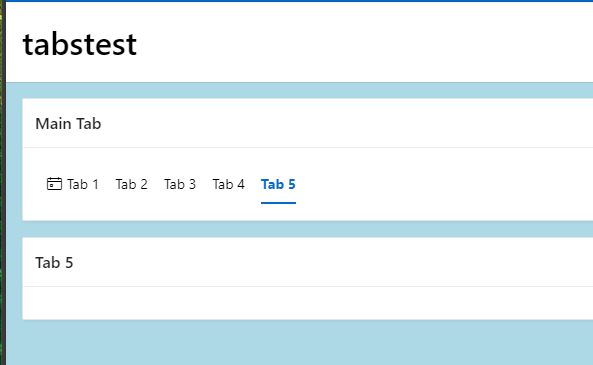
EXAMPLE:
Step 1 - Navigate to : Icons - Universal Theme (oracle.com)
Step 2- Select the desired Icon
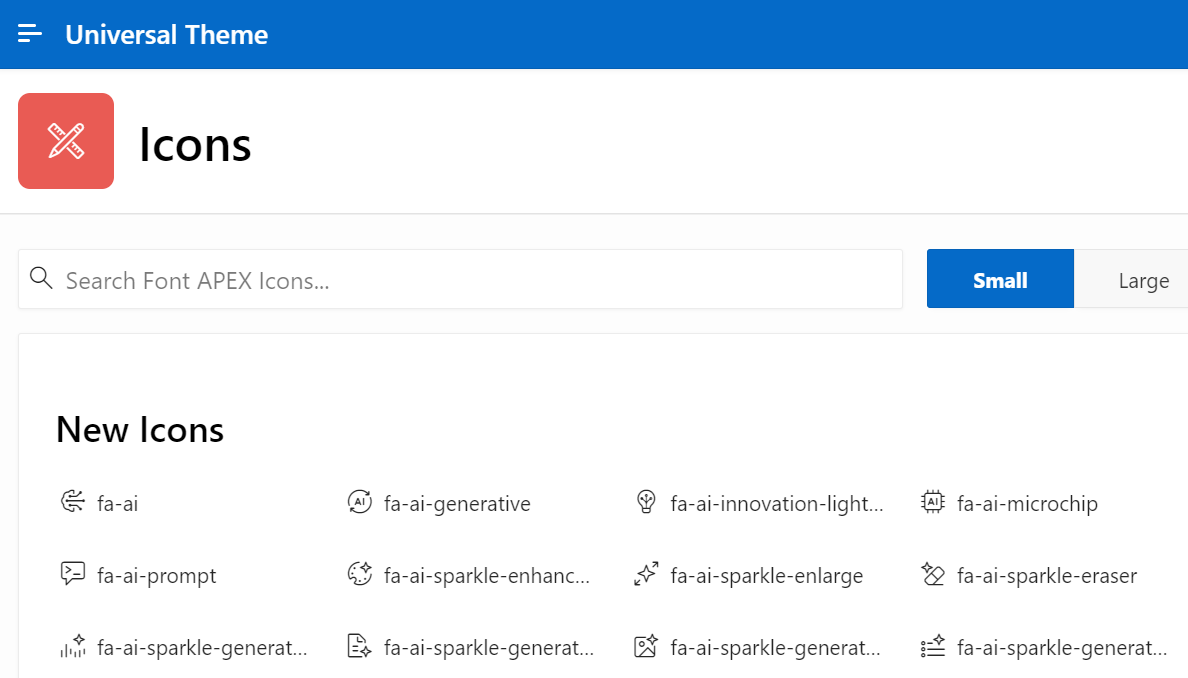
Step 3- Copy the icon “span” code
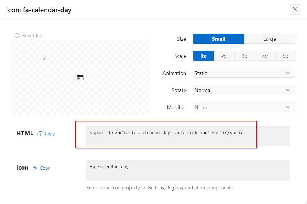
<span class="fa fa-calendar-day" aria-hidden="true"></span>
Step 4- place the code in the Name field of the region
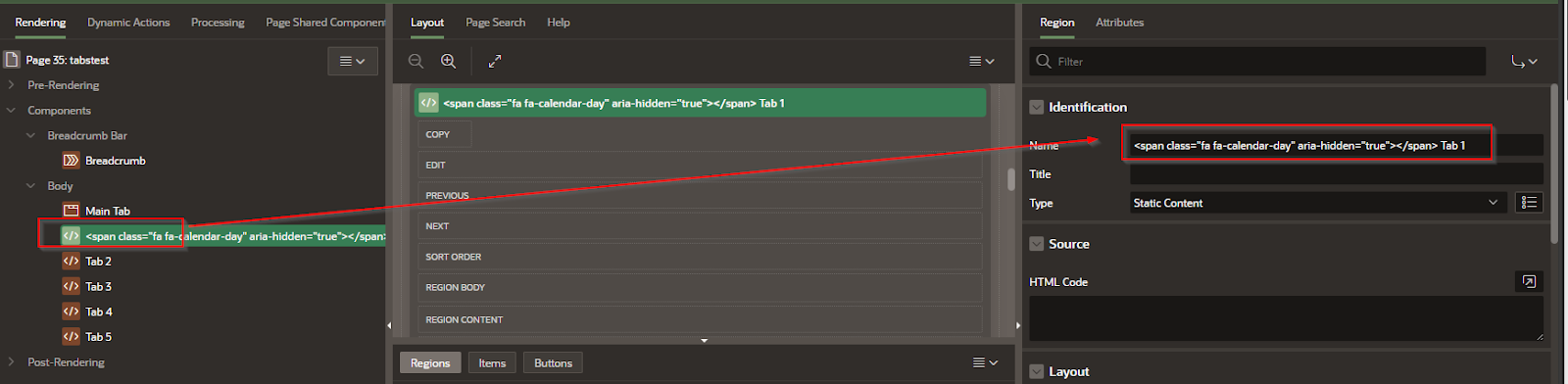
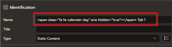
It should look something like this tab 1:
Conclusion
Adding icons to tab headers in Oracle APEX helps make your application more visually descriptive and easier to use. Whether you're highlighting dashboards, reports, or settings, icons provide quick visual cues that support usability and branding. With just a few HTML or CSS tweaks, you can turn plain tabs into polished, user-friendly navigation tools within your APEX interface.


No comments:
Post a Comment