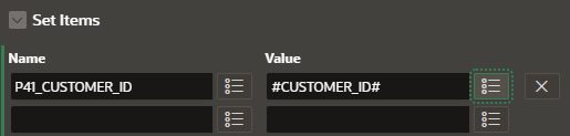
In Oracle APEX, badges are small visual indicators typically used to highlight numeric values, such as counts, statuses, or notification indicators. They are especially useful when you want to quickly draw attention to a value in reports, lists, cards, or even button labels. APEX makes it easy to integrate badges into your UI using built-in templates or manually with HTML and CSS. This blog explains how to use badges in various ways inside your APEX applications.
How to Use a Badge in Oracle APEX
There are several methods to display a badge, depending on the region type and use case. Here are the most common ways:
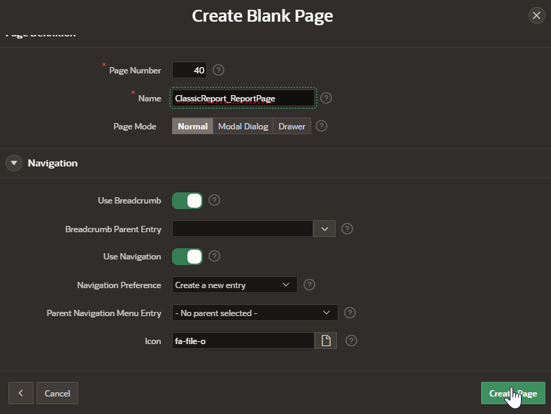
1. Badge in a Classic Report or Interactive Report
To show a badge inside a report, you can use HTML in your SQL query.
Example:
SELECT
  EMPLOYEE_NAME,
  DEPARTMENT,
  '<span class="t-Badge t-Badge--success">' || PROJECT_COUNT || '</span>' AS PROJECTS
FROM EMPLOYEES
Steps:
-
In the column where you want to display the badge (e.g., PROJECTS), write a SQL expression that wraps the value with a
<span>tag and thet-Badgeclass. -
In Page Designer, select the column and set Escape Special Characters to No to render the HTML.
2. Badge on a Button
You can also show a badge on a button label, often for notifications or counts.
Steps:
-
Edit the Button Label to include the badge HTML.
Example:
Notifications <span class="t-Badge t-Badge--warning">3</span>
3. Badge in a List or Card Report
When using lists or cards, Oracle APEX offers Badge settings as a native feature.
For Lists:
-
Go to Shared Components > Navigation Menu (or other list)
-
Edit the List Entry.
-
Use the “Badge Value” attribute to enter a number or expression.
-
You can set “Badge CSS Classes” like
t-Badge--success,t-Badge--warning,t-Badge--info.
For Cards:
-
When using a Card Region, set the Badge Value in the Attributes tab.
-
Customize the Badge Appearance (Color and Position) using predefined styles.
Badge Classes:
Here are some of the most used built-in classes for APEX badges:
-
t-Badge--success(green) -
t-Badge--warning(yellow) -
t-Badge--info(blue) -
t-Badge--danger(red) -
t-Badge--primary(default) -
t-Badge--pill(adds rounded edges)
Best Practices
-
Use badges for small, focused numeric or status indicators—avoid using them for long text.
-
Always set “Escape Special Characters” to No only if you're generating trusted HTML content.
-
For dynamic badges (e.g., unread messages), use PL/SQL or SQL queries that update the value in real-time.
-
Use consistent colors across the application to avoid confusing users (e.g., green always means success).
-
Avoid overusing badges—they should highlight key data, not overwhelm the interface.
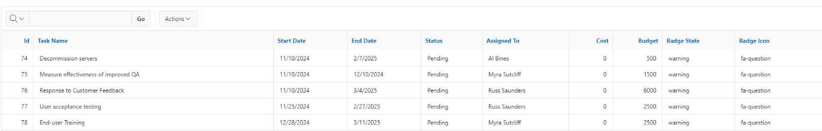
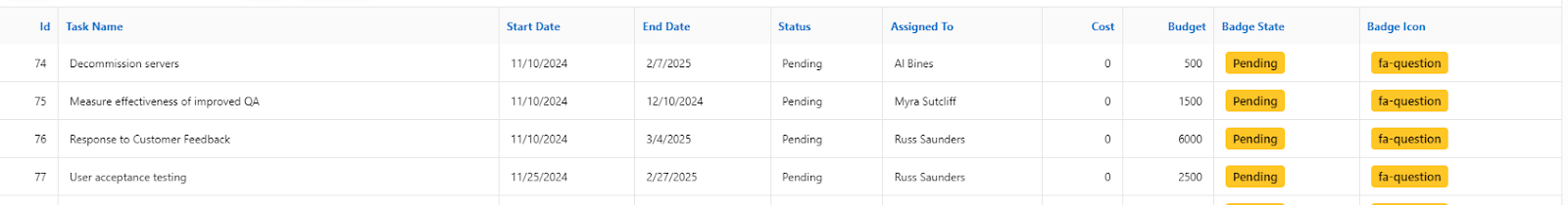
Badges are used in reports to display statuses, usually single words such as : Pending, Closed, and Open.
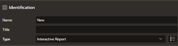
Interactive Report
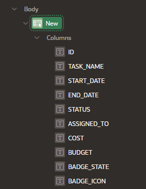

Query:
select ID,
TASK_NAME,
START_DATE,
END_DATE,
STATUS,
ASSIGNED_TO,
COST,
BUDGET,
case STATUS
when 'Closed' then 'success'
when 'Open' then 'danger'
when 'Pending' then 'warning'
else 'info'
end as BADGE_STATE,
case STATUS
when 'Closed' then 'fa-check'
when 'Open' then 'fa-exclamation'
when 'Pending' then 'fa-question'
else 'fa-info'
end as BADGE_ICON
from EBA_UT_CHART_TASKS
Now, make the following changes to the following
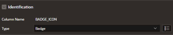
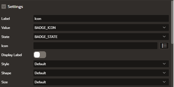
Badge State:
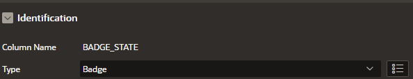
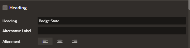
Badge Icon:
Classic Report


Query:
select ID,
TASK_NAME,
START_DATE,
END_DATE,
STATUS,
ASSIGNED_TO,
COST,
BUDGET,
case STATUS
when 'Closed' then 'success'
when 'Open' then 'danger'
when 'Pending' then 'warning'
else 'info'
end as BADGE_STATE,
case STATUS
when 'Closed' then 'fa-check'
when 'Open' then 'fa-exclamation'
when 'Pending' then 'fa-question'
else 'fa-info'
end as BADGE_ICON
from EBA_UT_CHART_TASKS
Here is this result:

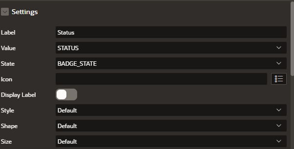
Make these changes to Badge-State column


{with/}
LABEL:=STATUS
VALUE:=#STATUS#
STATE:=#BADGE_STATE#
ICON:=#BADGE_ICON#
LABEL_DISPLAY:=N
STYLE:=t-Badge--subtle
SHAPE:=t-Badge--circle
{apply THEME$BADGE/}

SQL Query (with HTML for Badge on status, displaying other statuses)
SELECT
    task_name,
    TO_CHAR(start_date, 'DD-MON-YYYY') AS start_date,
    TO_CHAR(end_date, 'DD-MON-YYYY') AS end_date,

    -- Status with HTML badge
    CASE status
        WHEN 'Completed' THEN '<span class="t-Badge t-Badge--success">Completed</span>'
        WHEN 'In Progress' THEN '<span class="t-Badge t-Badge--info">In Progress</span>'
        WHEN 'Pending' THEN '<span class="t-Badge t-Badge--warning">Pending</span>'
        WHEN 'Overdue' THEN '<span class="t-Badge t-Badge--danger">Overdue</span>'
        ELSE '<span class="t-Badge">Unknown</span>'
    END AS status_badge,

    assigned_to,
    TO_CHAR(cost, 'FM$999,999.00') AS cost,
    TO_CHAR(budget, 'FM$999,999.00') AS budget

FROM tasks;
What You Need to Do in APEX
-
Go to your Report Region (Classic or Interactive Report)
-
Use the SQL above
-
In Column Attributes:
-
Hide the original
statuscolumn if you’re using a separatestatus_badge -
For
status_badge, set:-
Escape special characters: Uncheck (very important so APEX renders the HTML)
-
-
Available Badge CSS Classes in Oracle APEX
You can use these built-in badge classes:
| Status | CSS Class |
|---|---|
| Success | t-Badge--success |
| Info | t-Badge--info |
| Warning | t-Badge--warning |
| Danger | t-Badge--danger |
| Default/Gray | t-Badge |
Tips
-
Keep status values standardized (avoid spelling issues like
complete,Complete,COMPLETED) -
Consider using
statusas a LOV or ENUM to reduce data inconsistency -
Use Tooltips or colors for accessibility if used heavily
Oracle APEX Documentation
You can read more about badges in Oracle APEX UI components at:
https://docs.oracle.com/en/database/oracle/apex/
Conclusion
Badges in Oracle APEX are a simple but powerful way to improve the visual impact of your application. Whether in reports, lists, cards, or buttons, they help your users quickly identify important values or statuses. By using HTML, native attributes, or template options, you can control how and where badges appear, and style them consistently to align with your application’s design and purpose.