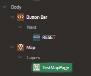
Faceted Reports with Cards in Oracle APEX combine the power of faceted search filters with a modern, card‑based layout to present data in an engaging and interactive way. Faceted Reports allow users to drill down into large datasets using multiple filter facets—such as categories, dates, or status—and see results update in real time. By choosing a “Cards” presentation template, each record is displayed as a visually distinct card, showing key attributes at a glance and supporting actions like links or buttons directly on the card itself. This approach is ideal for scenarios like product catalogs, employee directories, or any dataset where visual grouping and quick filtering improve user experience.
To create a Faceted Report with Cards in Oracle APEX, you first need a dataset that contains the records you want to display. Open your application in App Builder, then click Create → Page → Report → Faceted Search. Give the page a name and choose the table or SQL query as the data source. Once created, change the “Report Type” in the Faceted Search region to “Cards.” This switches the display from a classic list to card tiles, each representing a record.
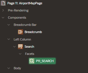
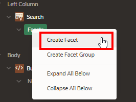
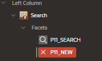
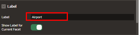
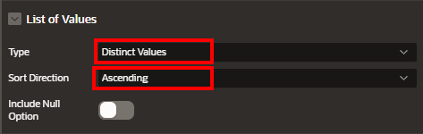
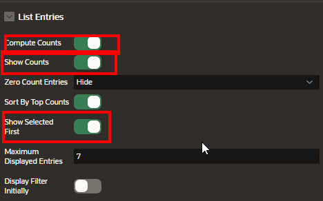
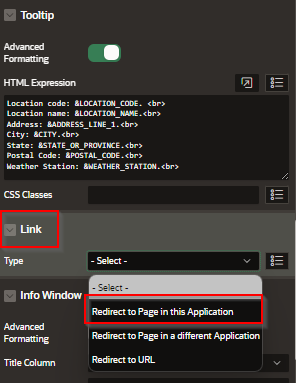
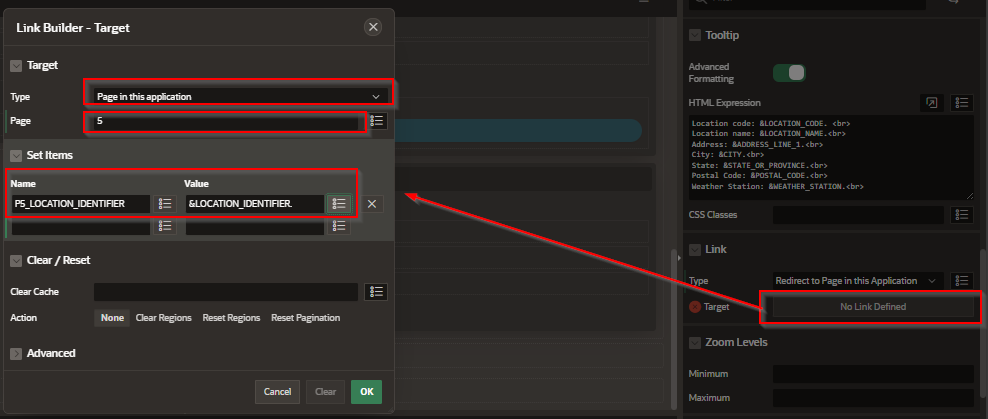
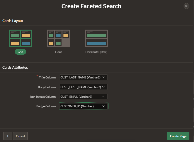
Next, define your facets (filters) by clicking the “Facets” section in Page Designer. For each facet—such as category, date range, or status—set the Type (e.g., List of Values, Slider, Date Picker) and bind it to the appropriate column or expression in your dataset. Configure the facet label and choose whether it allows single or multiple selections. Under the Cards region’s Attributes, map the card template fields: set the Title Column to the primary descriptive field (e.g., PRODUCT_NAME), Subtitle to a secondary attribute (e.g., CATEGORY), and Text to a longer description or HTML Expression. You can also add an Image Column if your data includes a URL for an image, and define Link Column settings to make each card clickable, redirecting users to detail pages or modal dialogs.
Finally, adjust the Cards layout under Appearance: choose the number of cards per row, card height, and text alignment. You can fine‑tune styling with custom CSS classes in Inline CSS or within the Theme Roller. Run your page to see faceted filters on the left (or top) and dynamically updating cards on the right, giving users both powerful search capabilities and a modern, visual presentation of data. This combination of faceted filtering and card layout delivers an engaging, user‑friendly interface that scales well for catalogs, dashboards, or any searchable card‑based content.
Example
Additional Customization
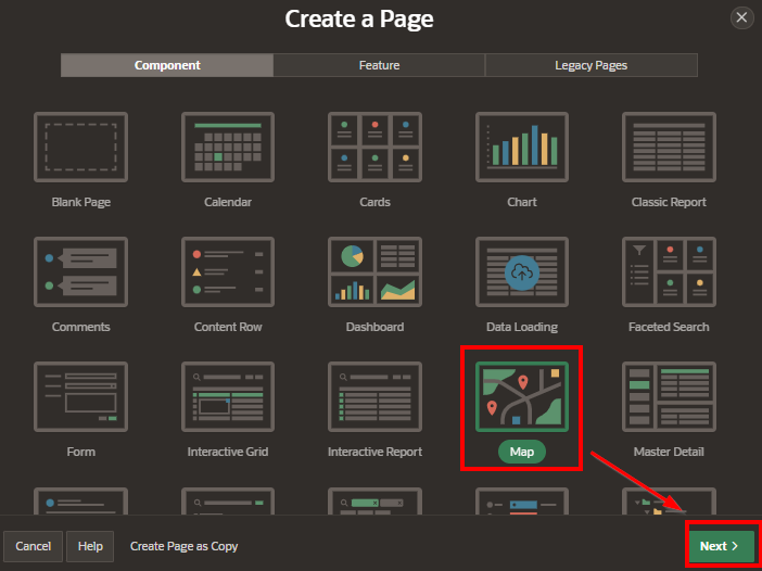
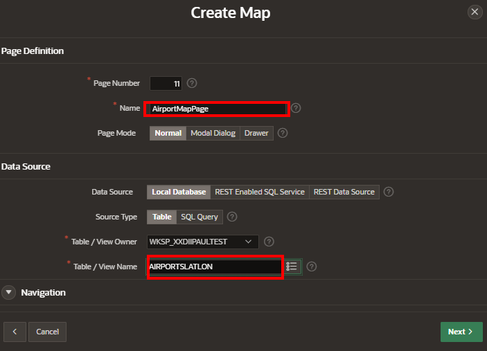
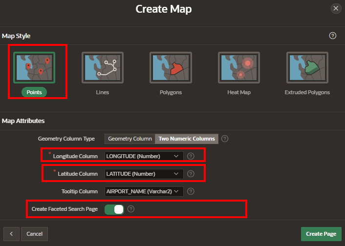
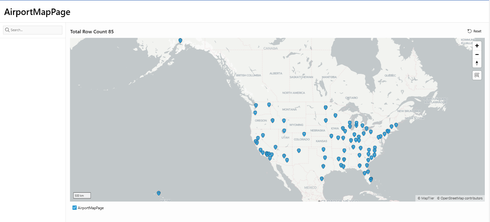
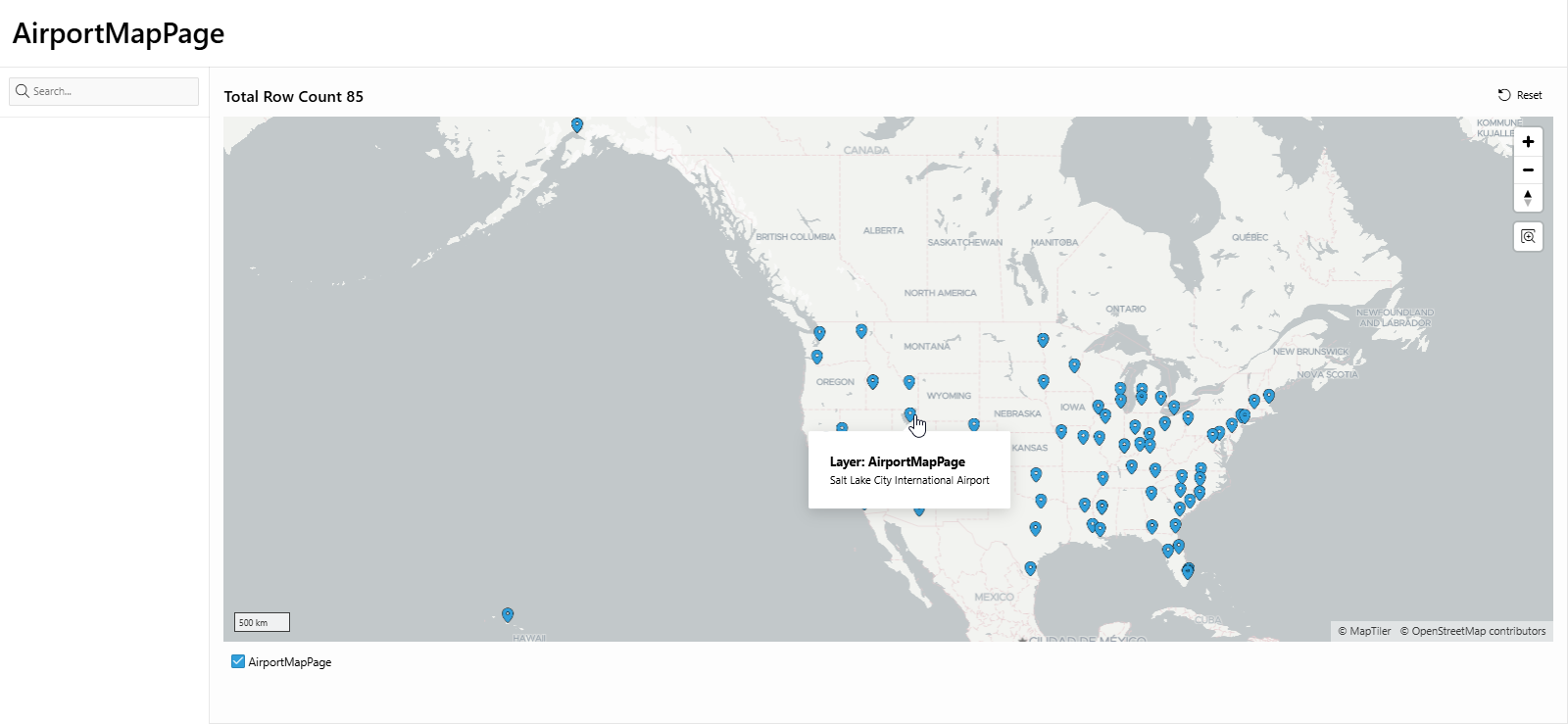
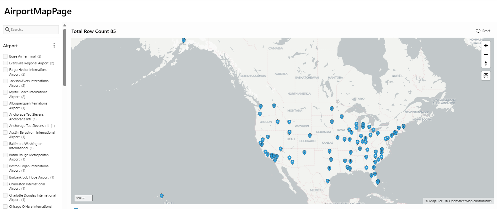
Filter Data on the Map: You can add filtering options to your page (e.g., drop-downs for selecting regions or airport types) so that users can narrow down the map markers.
Styling: You can customize the look and feel of your map by editing the page styles or adding custom CSS.
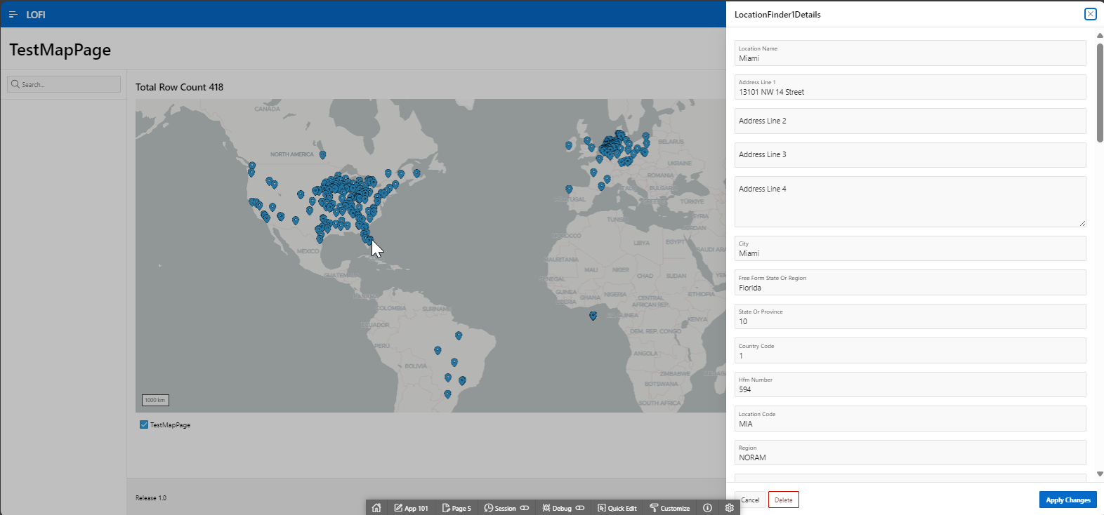
By following these steps, you can create a Map Report in Oracle APEX that displays airport locations using the AirportsLatLon table. The markers will be placed based on the Latitude and Longitude, and clicking on each marker will show more details about the airport, such as its name and IATA code.
Creating a Faceted Search Report with Cards in Oracle APEX
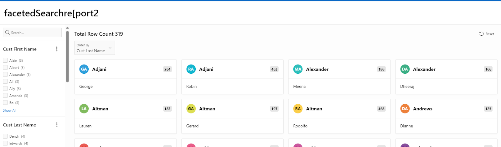
A faceted search report with cards in Oracle APEX allows users to refine their search dynamically using multiple filter options while displaying the results in a visually appealing card layout. This approach is useful for applications requiring interactive filtering, such as product catalogs, employee directories, or real estate listings.
Understanding Faceted Search Reports and Cards
Faceted Search Report
A faceted search is a dynamic filtering system that lets users refine data using multiple criteria. The facets appear as filter options on the side, allowing users to drill down into data by selecting relevant attributes.
Cards Report
The Cards Report displays data in a grid-like structure, where each row from a query is represented as a card with a customizable layout. It is useful for presenting information in a more visual format than standard reports.
By combining faceted search and cards, we can create an interactive and visually appealing data display in APEX.
Step 1: Creating the Faceted Search Report with Cards
1. Create a New Page
Open Oracle APEX and navigate to your application.
Click Create > Page.
Select Faceted Search and click Next.
Choose Cards as the report type.
Select the table or SQL query that will provide the data.
Click Next, configure the attributes as needed, and click Finish.
Step 2: Configuring the Faceted Search
Once the page is created, APEX automatically generates the faceted search region and a cards report.
1. Adding Facets
Open the Faceted Search Region in Page Designer.
Click + Add Facet to define a new filtering option.
Choose a data column for filtering. Examples include:
Category (e.g., Department, Product Type)
Price Range (e.g., Low, Medium, High)
Date (e.g., Created Date, Last Updated)
Select the appropriate facet type:
Checkbox List: Multiple selections
Range Slider: For numerical values like price
Date Picker: For filtering by date
Configure the display settings, labels, and sorting.
Click Apply Changes.
Step 3: Configuring the Cards Report
1. Customizing the Card Appearance
Open the Cards Report region in Page Designer.
Under Appearance, customize:
Card Title: Select the column to display as the card title.
Card Body: Choose additional columns for description or details.
Card Media: Assign an image column if available.
Card Actions: Add buttons or links for user interaction.
2. Adjusting the Card Layout
Under Attributes, modify the number of cards per row.
Choose different layouts like Grid, Floating, or Stacked.
Enable Lazy Loading to improve performance on large datasets.
Step 4: Enhancing with Dynamic Actions
1. Refreshing Cards When a Facet Changes
Go to Faceted Search Region in Page Designer.
Under Dynamic Actions, create a new action:
Event: Facet Value Changed
Action: Refresh
Affected Element: Cards Report
This ensures that selecting a facet automatically refreshes the results without a full-page reload.
Step 5: Adding Custom Styling with CSS
For a more refined appearance, apply CSS styling to modify the card design.
1. Adding CSS to Improve Card Display
Navigate to Shared Components > Themes > Custom CSS.
Add custom CSS:
.t-Card {
border-radius: 10px;
box-shadow: 2px 2px 10px rgba(0, 0, 0, 0.1);
transition: transform 0.3s ease-in-out;
}
.t-Card:hover {
transform: scale(1.05);
}
This enhances the card appearance with rounded corners, shadows, and a hover effect.
Step 6: Testing the Faceted Search Report with Cards
Click Run Page in APEX.
Use the facet filters to refine the data dynamically.
Observe how the results update within the card layout.
Adjust facets and styling as needed for an optimal user experience.
Best Use Cases for Faceted Reports with Cards
Product Catalogs: Allows filtering by category, price, and availability.
Employee Directories: Filters employees by department, role, and location.
Real Estate Listings: Enables searches based on price, location, and property type.
Event Listings: Allows filtering by date, category, and venue.
A faceted search report with cards in APEX provides an interactive and user-friendly way to display data. By integrating filters, dynamic actions, and CSS styling, you can create a highly functional and visually appealing report.
This approach improves usability, enhances data exploration, and offers a modern, responsive interface.
EXAMPLE:

By implementing a Faceted Report with Cards in your APEX application, you give users an intuitive interface for both exploration and discovery. The faceted filters empower them to narrow results quickly, while the card layout highlights individual record details in a compact, visually appealing format. Together, these features create a dynamic and responsive report that adapts to user needs, making data browsing faster and more engaging without sacrificing performance or flexibility.